S&P 500: Spotting Long Term Accumulation & Distribution Zones

A long-horizon study examining how percentage deviations from the 365-day moving average can be used to forecast future risk conditions on the SPX.

This material is provided for general informational and educational purposes only. It does not constitute financial advice or a recommendation.

Context

This case study contains 2 sections. The first details how percentage deviations below the 365-day mean signal accumulation conditions. The second covers how deviations above it signal distribution risk.

The reference framework explored includes:

  • The 365-day simple moving average as a proxy for long-term 'baseline valuation' from which reference bands are derived
  • 10, 15, 20, and 30% drawdown bands below the mean, and 5, 10, 15, and 22% extension bands above it

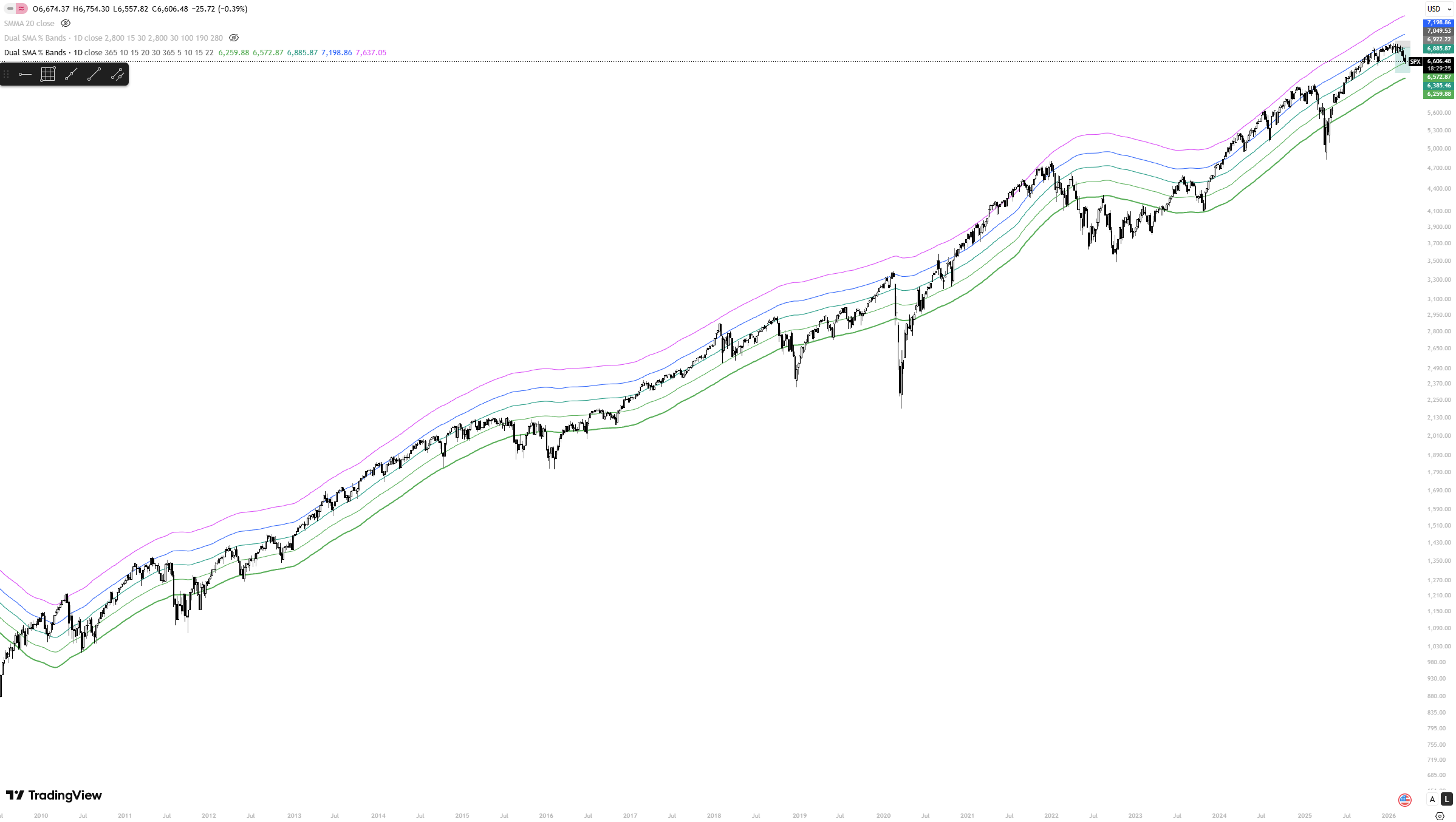
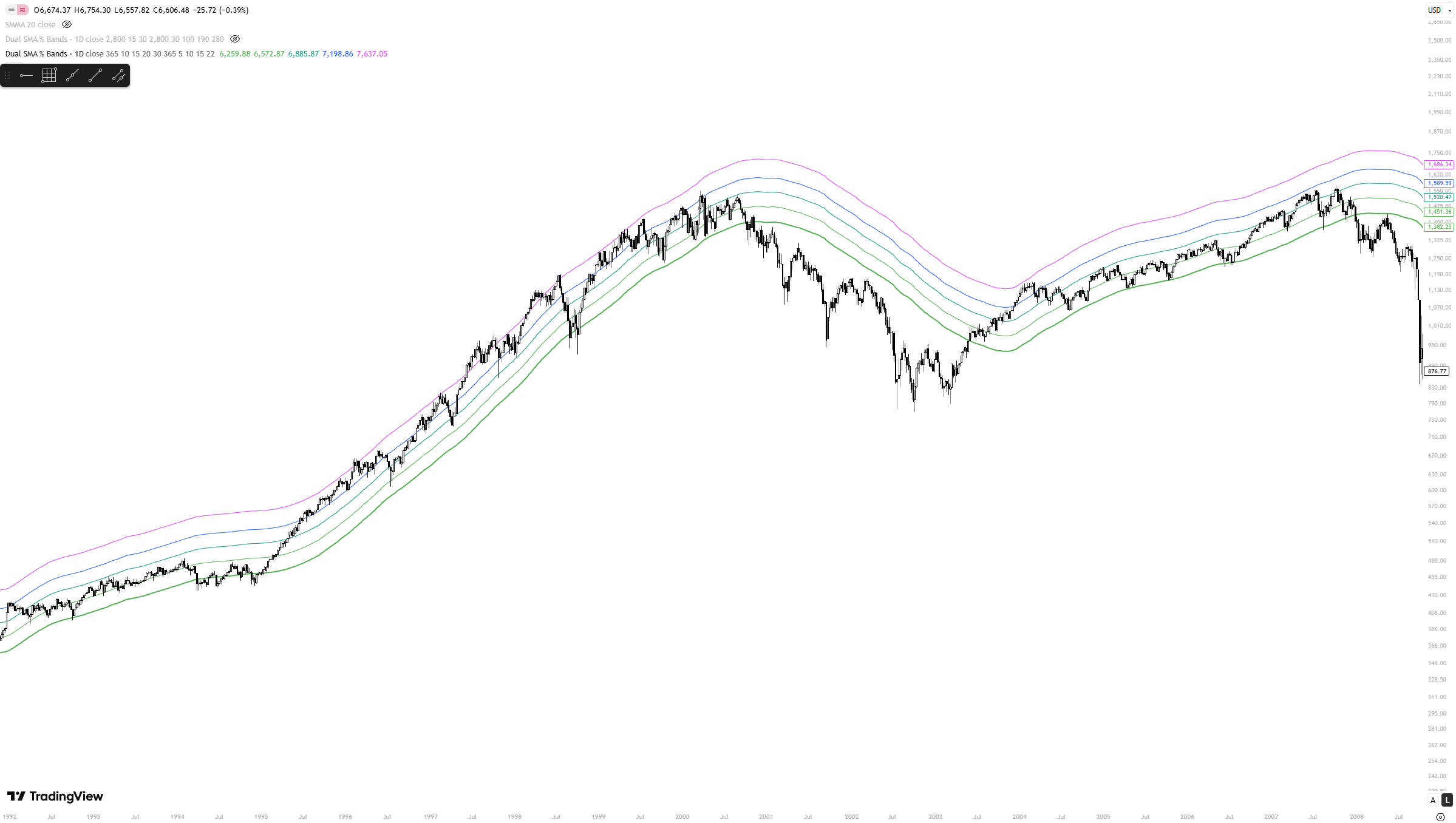
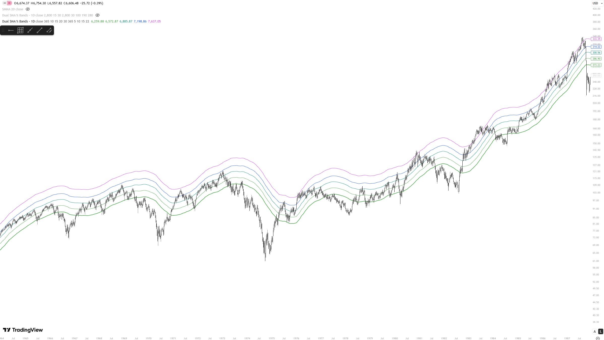
Section 1: Drawdown Bands

When the SPX trades below its 365-day mean, it enters zones where long-term risk has historically been skewed to the upside. The bands at 10%, 15%, 20%, and 30% below the yearly average define a tiered accumulation map, each level representing a progressively rarer dislocation from trend.

These are not buy signals. They are conditions that, across nearly nine decades of data, have consistently preceded above-average returns. The deeper the breach, the stronger the historical precedent. (Zoom in to view charts)

SPX drawdown bands 2009 to present
SPX, drawdown bands, 2009-present. COVID and 2022 mark the two key accumulation windows of the modern era (Dan's source code) | TradingView
SPX drawdown bands dot-com and GFC
SPX, drawdown bands during the dot-com unwind and Global Financial Crisis | TradingView
SPX drawdown bands mid-century cycles
SPX, drawdown bands across mid-century regimes including the 1973-74 bear market | TradingView
SPX full history drawdown bands 1938 to present
SPX daily, drawdown bands from the 365-day SMA, 1939-present | TradingView

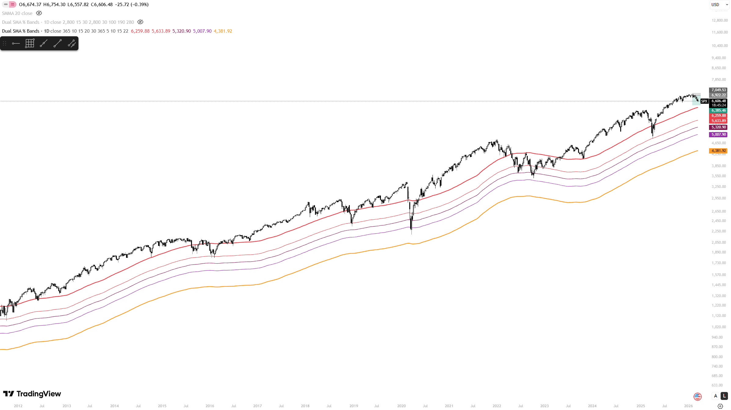
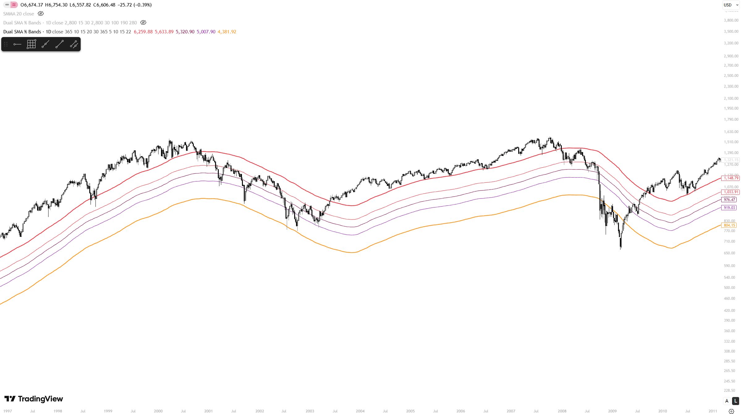
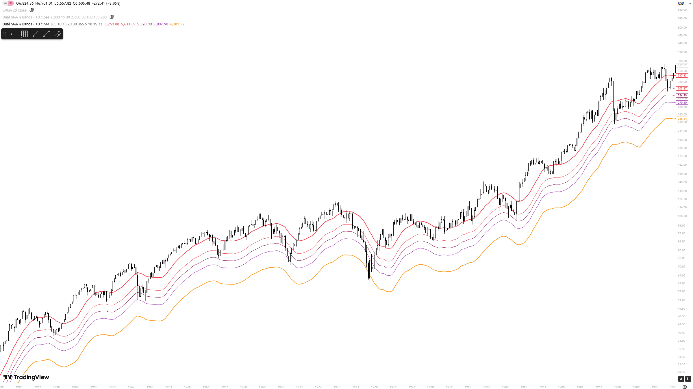
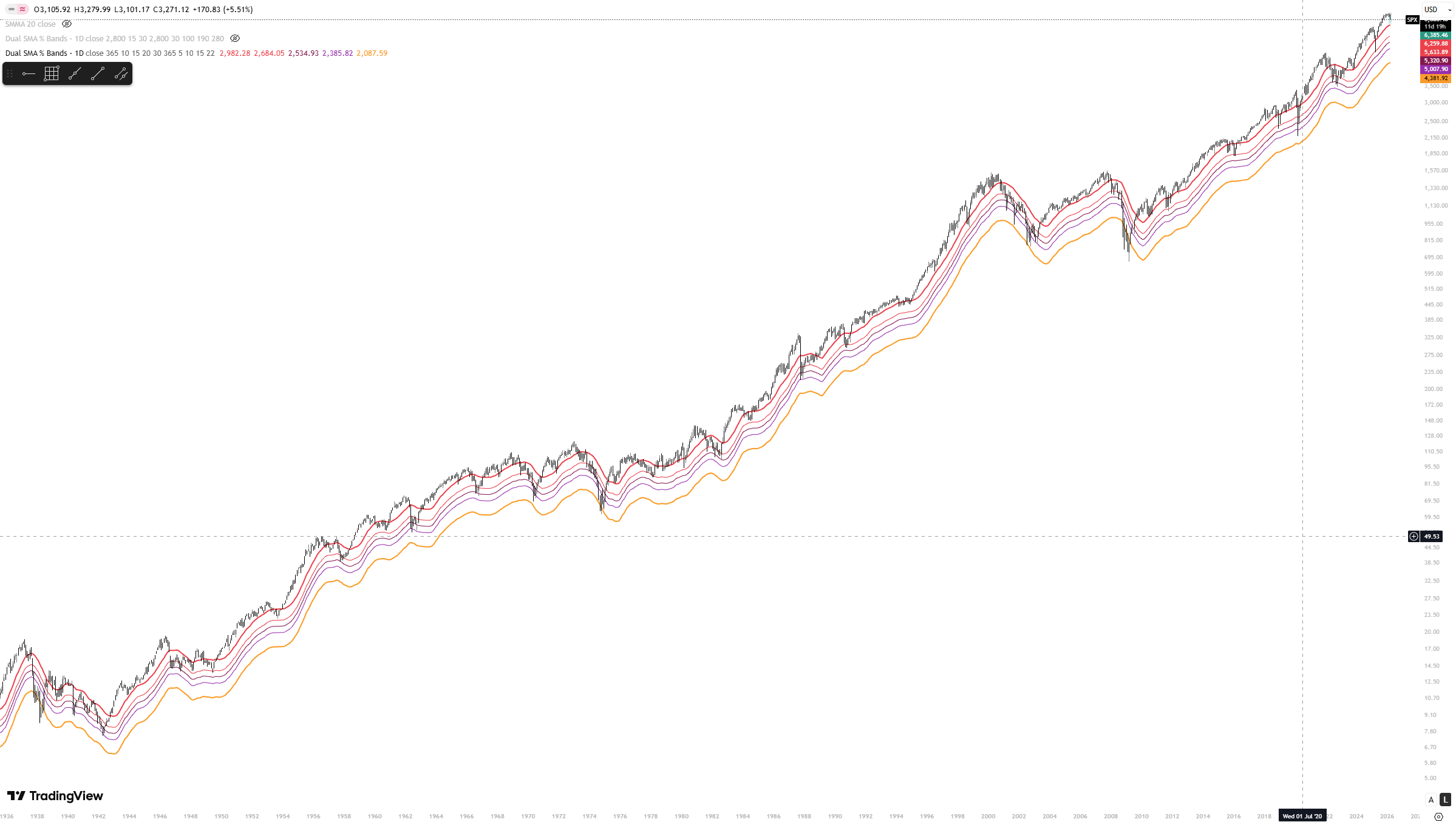
Across all regimes, the framework holds a consistent read: the 10-15% zone flags elevated long-term value; the 20-30% zone has marked generational entry conditions. In the post-2009 bull market, corrections have rarely breached the 15% band, making any such reading a significant signal going forward.

Section 2: Extension Bands

When the SPX trades above its 365-day mean, forward risk increases. The extension bands at 5%, 10%, 15%, and 22% above the yearly average map the degree of overextension and with it, the probability of a correction compressing returns over the following period.

The 5-10% zone is common in healthy bull markets. It is the 15-22% zone that historically coincides with speculative excess and precedes the sharpest drawdowns. These readings do not predict timing. They define elevated-risk conditions.

SPX extension bands 2010 to present
SPX, extension bands, 2010-present. The 15-22% zone flagged elevated risk ahead of both the 2022 drawdown and the 2025 correction | TradingView
SPX extension bands dot-com bubble
SPX, extension bands during the dot-com bubble. Price sustained above the 22% band through 1999-2000, the most extreme overextension in modern history | TradingView
SPX extension bands 1965 to 1985
SPX, extension bands, 1965-1985. Upper band readings consistently preceded cyclical peaks | TradingView

The Dual-Band Framework

Together, the two band sets create a single risk map centred on the 365-day mean:

  • Deep below the mean: accumulation zone. Risk is compressed, return potential is elevated.
  • Near the mean: neutral. The market is fairly valued relative to its own trend.
  • Materially above the mean: Risk is elevated, return potential is compressed.

Interpretation

These bands are a risk lens, not a timing tool. Their value is in defining the condition of the market relative to its long-run trend, which shapes position sizing, risk appetite, and time horizon decisions.

Used alongside other indicators such as macro regime analysis and market breadth, they become a meaningful input into a forward-looking risk framework.